
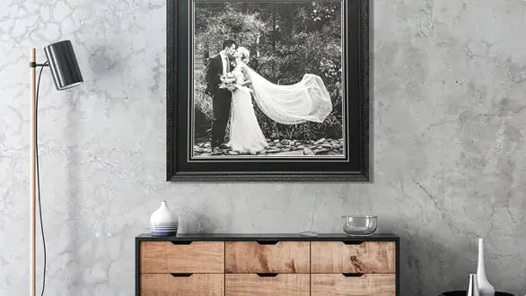
Acrylic prints suit sharp, modern spaces and photos with strong detail. Canvas prints suit softer, warmer spaces and photos with emotional value. Your choice depends on the look you want, the room lighting, and how you plan to display the image.
Some photos suit a sharp, glass-like finish. Others feel better with a softer, textured look. This guide breaks down how each option works, where it suits best, and how to choose the one that will actually look right in your space.
Acrylic and canvas prints differ in how the image is finished, displayed, and experienced on your wall.
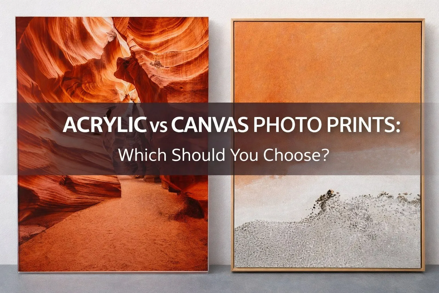
An acrylic print uses a high-resolution photo print that is face-mounted to a clear acrylic panel. This process adds depth, sharpness, and a clean, glass-like finish. Colours appear more vibrant, and fine details stand out.
A canvas print uses a printed canvas material that is stretched over a frame. The surface has a visible texture, which softens the image and reduces glare. This creates a more relaxed, painterly look.
The choice comes down to the result you want. Acrylic delivers a crisp, modern finish with strong visual impact. Canvas offers a softer feel that suits more casual or personal spaces.
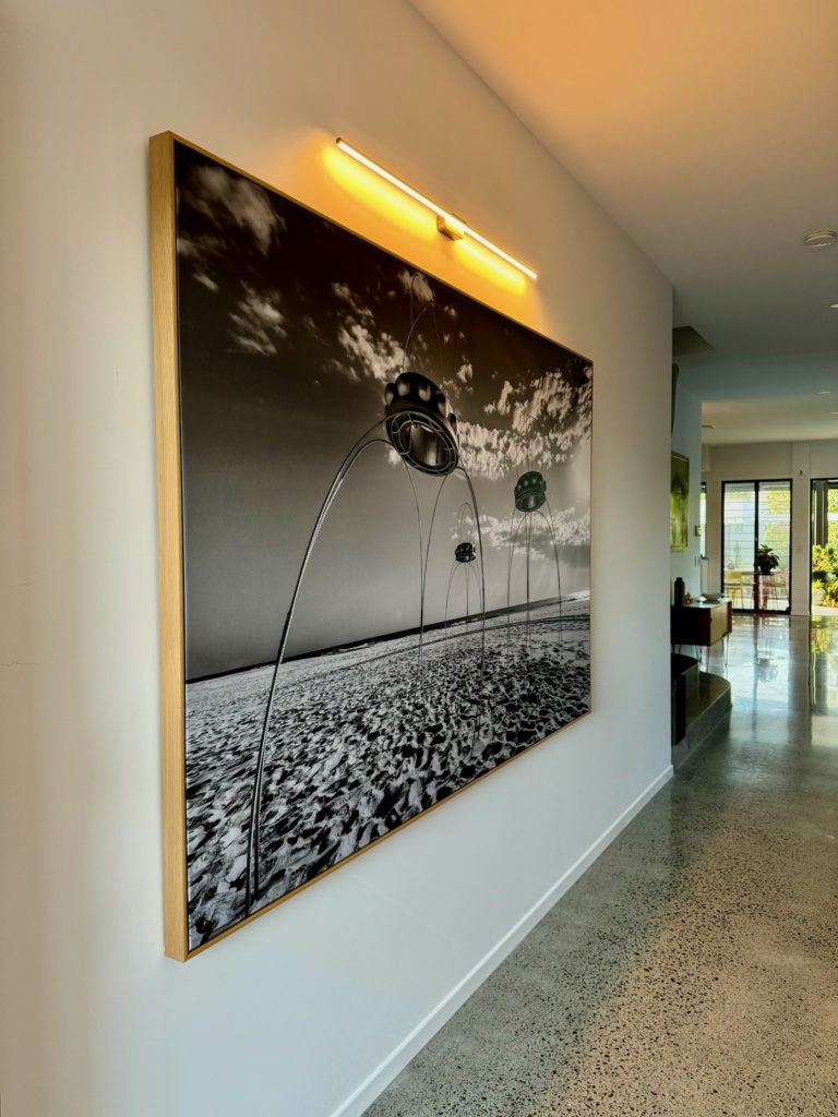
Acrylic prints are a strong choice when you want your photo to look clean, sharp, and well-defined on the wall.
They tend to suit modern spaces where a smooth, polished finish feels consistent with the room. If your space uses simple lines, neutral colours, or a more minimal style, acrylic will usually sit comfortably without feeling out of place.
They also work well for images with a high level of detail. Landscapes, city scenes, and professional photography benefit from the added clarity that comes from face-mounting the print to acrylic. Colours appear more vivid, and small details stay clear, even at larger sizes.
It is also worth thinking about lighting. In spaces where glare is not an issue, acrylic can add a subtle sense of depth as light interacts with the surface. This can make the image feel slightly more defined compared to softer finishes.
If your goal is a finish that feels precise and visually clean, acrylic is often the better option.
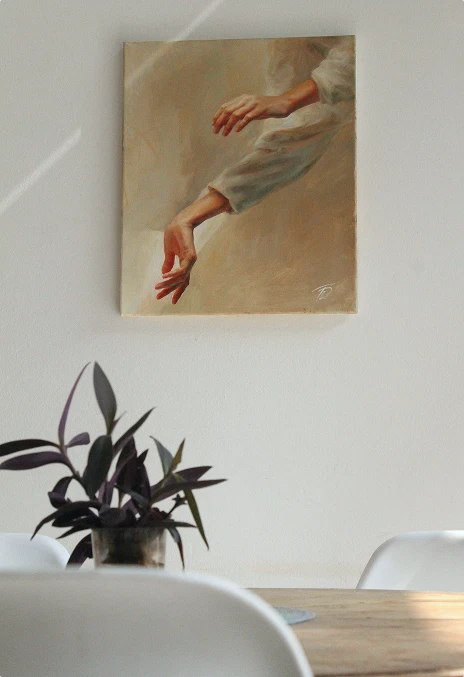
Canvas prints work well when you want your photo to feel softer and more relaxed on the wall.
They tend to suit homes with a warmer or more casual style. If your space includes natural textures, timber, or a mix of décor, canvas usually fits in without drawing too much attention to itself.
They are also a good option for personal photos. Family moments, travel shots, and everyday images often feel more natural on canvas. The textured surface softens fine detail slightly, which can give the image a more timeless feel.
Lighting is less of a concern with canvas. The matte surface does not reflect much light, so it works well in bright rooms or areas with direct sunlight.
If you want something that feels easy to live with and blends into your space, canvas is often the better choice.
| Feature | Acrylic Prints | Canvas Prints |
| Finish | Smooth, glossy, glass-like | Matte, textured surface |
| Image Detail | Very sharp, high clarity | Slightly softened detail |
| Colour | Vibrant and high contrast | More natural and balanced tones |
| Style Suitability | Modern, clean interiors | Warm, relaxed or classic spaces |
| Glare | Can reflect light in bright areas | Minimal glare |
| Durability | Rigid surface, easy to wipe clean | Durable but can mark or dent with pressure |
| Best For | Landscapes, detailed photos, statement pieces | Family photos, portraits, everyday moments |
This comparison gives a quick view of how each option performs. The right choice still depends on your photo, your space, and the look you want to achieve.
Choosing between acrylic and canvas becomes easier when you focus on a few key factors. Use the points below to guide your decision.
Acrylic suits modern spaces with clean lines, neutral colours, and minimal styling. It adds a crisp finish that feels structured and refined.
Canvas suits warmer spaces that use texture, timber, or layered décor. It blends in more naturally and does not feel as sharp or dominant on the wall.
Choose acrylic if your photo needs strong detail, contrast, or sharp focus. This includes landscapes, city scenes, or professional images. The face-mounted finish keeps edges clean and colours defined.
Choose canvas if your photo is more personal or softer in tone. Family photos, travel shots, and candid moments often feel more natural with a slight texture. Canvas can also be more forgiving for lower-resolution images
Canvas is the safer option in bright rooms or areas with direct sunlight. The matte surface reduces glare and keeps the image easy to view from different angles.
Acrylic works well in spaces where you can manage lighting. In the right setting, it adds depth as light interacts with the surface, but strong glare can affect visibility.
Acrylic works well as a focal point. It suits living rooms, offices, and open spaces where you want the image to stand out.
Canvas suits bedrooms, hallways, and more relaxed areas where you want the artwork to feel part of the space rather than the centre of attention.
Acrylic has a rigid surface that is easy to clean and resists moisture. It is a good option for high-traffic areas or spaces like kitchens.
Canvas is durable but can be marked if pressed or knocked. It does not require much cleaning, but it should be handled with a bit more care.
When you look at these factors together, the right choice usually becomes clear based on your space and the photo you want to display.
Most comparisons focus on finish and style, but a few practical details can make a big difference once the print is on your wall.
Acrylic can reflect light, especially in rooms with large windows or overhead lighting. This can affect how the image looks from different angles. Canvas avoids this issue, so the image stays consistent no matter where you stand.
Acrylic prints often sit slightly off the wall with a floating effect, which gives a clean, modern look. Canvas sits flatter and feels more integrated into the space. This small difference can change how the piece reads in the room.
Acrylic is easy to wipe clean with a soft cloth, which makes it practical in busy areas. Canvas does not need much maintenance, but it should not be scrubbed or exposed to pressure, as the surface can be marked.
Both options hold up well over time when produced correctly. Acrylic handles humidity and temperature changes slightly better, which can matter in areas like kitchens or coastal homes. Canvas remains stable in most indoor settings but benefits from a more controlled environment.
Canvas can be framed or left as a stretched piece for a more casual look. Acrylic is usually frameless, which suits a clean, modern finish. Your choice here can influence the overall style just as much as the print itself.
These details are easy to overlook at the start, but they often shape how satisfied you are with the final result.
The right choice depends on how you want the photo to look once it is on your wall.
Acrylic suits images with strong detail and colour. It keeps everything sharp and works well when you want the print to stand out.
Canvas suits more personal or relaxed images. It softens the finish slightly, which can make photos feel more natural and easier to live with.
If you want a clean, defined result, acrylic is the better choice. If you want something softer and more subtle, canvas will usually feel right.
If you are unsure, getting advice before printing can help you choose with confidence.
If you are still weighing up your options, a quick chat can make the decision easier. The same photo can look quite different depending on the finish, and a small change can improve the final result.
At GC Printing & Framing, you can work with our framing consultant to choose the right option. We look at your image, your space, and how you plan to display it, then help guide you toward a finish that will look right once it is on your wall. We can also talk through sizing, placement, and presentation so everything works together.
Visit our Gold Coast showroom today, or get in touch to discuss your project.

An archival print is a print produced with pigment-based inks and acid-free paper or canvas to resist fading, yellowing and chemical breakdown over time. When displayed correctly, it can maintain colour accuracy and structural stability for decades.
The term “archival” refers to material stability. It depends on three factors: the ink, the paper or canvas, and how the print is handled and displayed. If one element fails, the print’s lifespan reduces.
Understanding what makes a print archival helps you assess quality before you buy. Below, we explain the meaning of archival ink, archival paper, how archival compares to giclée printing, and how long an archival print can really last.
An archival print relies on stable materials that resist chemical change and light damage. Three elements determine whether a print qualifies as archival:
Pigment inks contain solid colour particles that sit on or bond with the paper surface. These particles resist UV light and environmental exposure better than dye-based inks. This stability reduces fading and colour shift over time.
Archival paper is acid-free and often lignin-free. Acid in paper causes yellowing and brittleness as it ages. Removing acid slows deterioration and supports long-term stability. The same principle applies to archival-grade canvas.
Even the best ink and paper can fail if exposed to direct sunlight, high humidity, or poor mounting materials. Archival prints benefit from:
A print is archival when the materials and finishing methods work together to preserve colour and structure for the long term.
Archival ink refers to ink that resists fading and chemical breakdown over time. In modern printing, this usually means pigment-based ink rather than dye-based ink.
Pigment inks contain microscopic solid particles suspended in a liquid. After printing, these particles remain stable on the surface of the paper or canvas. They resist UV light and airborne pollutants more effectively than dye inks.
Dye-based inks dissolve colour into the liquid carrier. This allows strong colour vibrancy, but the dyes are more sensitive to light and environmental exposure. Over time, dye prints can fade or shift in colour faster than pigment prints.
When a printer describes ink as “archival”, they are typically referring to pigment ink systems designed for long-term image stability.
In practice, archival ink and pigment ink are often used interchangeably. Most archival print systems rely on pigment-based ink because of its lightfast properties.
However, the term “archival” describes performance, while “pigment” describes ink composition. A pigment ink contributes to archival quality, but true archival printing also requires stable paper and proper finishing.
Archival paper is paper manufactured to resist chemical deterioration over time. It is acid-free and often lignin-free. These properties reduce yellowing, brittleness and structural breakdown as the paper ages.
Paper contains cellulose fibres. If acid remains in the paper, those fibres degrade faster. Acid-free production removes this risk. Many archival papers are also buffered with an alkaline reserve to neutralise environmental acids absorbed during display.
Lignin is a natural component found in wood pulp. When exposed to light and air, lignin can cause paper to darken. Lignin-free papers reduce this risk and support long-term colour stability.
Archival canvas follows the same principle. It uses stable base materials and coatings designed to work with pigment inks without premature cracking or discolouration.
Both paper and canvas can be archival if they meet stability standards.
The archival quality depends on the base material, coating, and ink used. Canvas is not automatically archival, and paper is not automatically stable. The material must be manufactured and handled correctly.
The terms giclée and archival print are often used together, but they do not mean the same thing.
A giclée print refers to a high-resolution inkjet print produced using professional pigment-based inks. The term describes the printing method and quality standard. It is commonly used in fine art and photographic reproduction.
An archival print refers to longevity. It describes a print made with stable materials that resist fading and deterioration over time.
In many cases, a giclée print is also archival because it uses pigment inks and archival-grade paper. However, the terms focus on different aspects:
A print can be produced using a giclée method, but fail to be archival if it uses unstable paper or poor framing materials. Likewise, a pigment-based archival print may be described as giclée if it meets fine art reproduction standards.
Understanding this distinction helps you assess what a printer is actually offering. Ask about the ink type, the paper, and the mounting materials, rather than relying on one label.
An archival print can last 50 to 100 years or more under controlled indoor display conditions when produced with pigment-based inks on acid-free paper or canvas. Some independent laboratory tests on leading pigment ink systems suggest even longer potential longevity in ideal conditions.
In a typical home environment with indirect natural light, an archival print can often maintain colour stability for several decades before any noticeable fading occurs.
Lifespan reduces when the print is exposed to:
UV exposure is the most significant factor. Direct sun can cause visible fading within a much shorter timeframe compared to a shaded indoor display.
Framing plays a critical role. UV-filtering glass or acrylic, acid-free matboards, and proper backing materials help protect the print and extend its life.
Archival printing increases longevity, but display conditions determine how close the print comes to its maximum potential lifespan.
Archival printing is worth it when longevity and colour stability matter.
If you are printing fine art, wedding photography, limited edition prints, or sentimental images, archival materials reduce the risk of fading, yellowing and structural damage over time. The higher material standard protects both visual quality and emotional value.
For professional photographers and artists, archival printing supports consistent colour reproduction and meets gallery or client expectations. Many collectors and exhibition spaces expect pigment-based prints on acid-free substrates.
For corporate environments and high-traffic spaces, archival materials provide greater durability under controlled indoor lighting.
If you are printing short-term promotional material or temporary décor, archival specifications may not be necessary. The value depends on the purpose of the print.
Archival printing increases upfront cost, but it reduces replacement risk and protects long-term display quality.
Use this checklist to assess whether a print qualifies as archival:
If one element is missing, the print’s lifespan reduces. True archival quality depends on the complete system, not a single material.
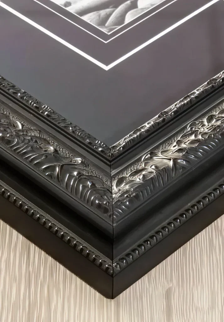
Photo framing no longer sits quietly in the background of a room. In 2026, it plays a visible role in how spaces feel and how images are experienced.
Interior design has shifted toward warmer tones, softer shapes, and more confident wall displays, and framing trends are moving with it.
Light oak and ultra-thin frames are giving way to darker timbers, floating frames, curved profiles, and larger gallery-style layouts. These changes reflect how people are rethinking their walls, not as decoration, but as part of the room itself.
This article outlines the photo frame trends defining 2026 interiors, drawing from current design movement and framing patterns seen across modern homes and workspaces.
Several framing styles are standing out as interiors continue to shift in tone and scale. These trends reflect broader design movement rather than short-term styling choices.
Together, these photo frame trends point to a clear direction for 2026. Frames feel warmer, more intentional, and more connected to the space around them.
Light oak has dominated photo framing for several years. In 2026, that dominance is easing as darker timber tones gain momentum.
Walnut and deeper stained frames are appearing more often in framed photography. These finishes add warmth and visual weight, helping images sit more confidently within a space. The shift reflects broader interior design movement toward richer colour and layered materials.
Darker timber frames are appearing more frequently in 2026 interiors, reinforcing framing as a visual element rather than a background detail.
Slim frame designs remain a strong photo frame trend in 2026, but they no longer feel light or understated.
Instead of very fine, barely visible profiles, slim frames are appearing with slightly increased depth and a more solid build. From the front, the frame still reads as clean and narrow. From the side, it carries more presence on the wall.
This change reflects a move away from flat, minimal surfaces. Slim frames still suit modern interiors, but they now feel more deliberate and grounded rather than subtle or fragile.
Floating frames are not new, but they are definitely not going anywhere in 2026.
By separating the image from the frame, floating frames create a clear visual structure. This approach supports organised wall layouts and works well across both single pieces and larger gallery walls. The result feels intentional and consistent, which aligns with interiors that favour clarity and balance.
As framing moves toward more considered presentation, floating frames remain a reliable choice. Their continued use reflects practicality and visual order rather than trend-driven change.
After years of sharp lines and square profiles, softer frame shapes are starting to reappear in 2026 interiors.
Curved corners and rounded internal edges reflect a wider shift in interior design toward softer, more deliberate forms. This movement shows up in furniture, lighting, and architectural details, and framing is following the same direction.
These frames introduce contrast against straight walls and linear layouts. Rather than feeling decorative, the softened shapes help balance rooms that lean heavily on clean lines and structured layouts.
Frame profiles with subtle detail are appearing more often in 2026 interiors. These are not ornate or traditional frames, but slim designs that include light shaping or a fine inner step.
The detail is minimal and often only noticeable up close. From a distance, the frame still reads as clean and simple. This approach adds depth and interest without competing with the image or the surrounding space.
This shift reflects a move away from flat, featureless frames. Instead of decoration for its own sake, small profile details are being used to give frames more character while keeping the overall look controlled and modern.
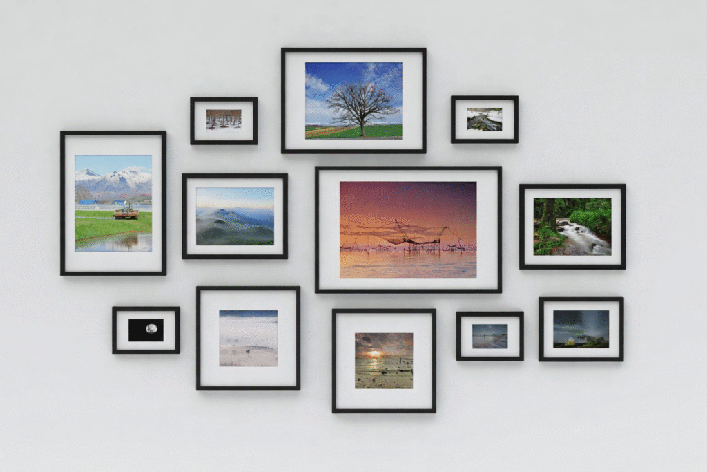
Gallery walls are growing in size in 2026, but not through the use of oversized frames. Instead, the trend is toward larger wall coverage made up of many smaller framed pieces.
These expanded gallery walls stretch across wider sections of wall and feel more intentional in their layout. The repetition of smaller frames creates rhythm and cohesion, allowing the display to read as a single visual feature rather than a loose collection.
This shift reflects a move toward confident wall planning. Gallery walls are no longer secondary decoration. They are being used to anchor rooms and define space through scale and consistency.
Metallic frames continue to appear in 2026, but their use has become more controlled. High-shine finishes are giving way to softer metallic tones with a muted surface.
Brushed gold, bronze, and similar finishes are being used as accent frames rather than dominant features. These tones introduce contrast against neutral walls and timber elements without drawing focus away from the image.
This restrained approach reflects how interiors are balancing warmth with variation. Metallic frames remain part of the framing landscape, but they now support the overall composition rather than leading it.
Taken together, photo frame trends for 2026 point to a clear direction. Frames feel warmer, more structured, and more intentional in how they appear within a space.
Light finishes and sharp minimalism are making room for depth, texture, and scale. Gallery walls are larger, frame profiles carry more presence, and presentation is planned as part of the room rather than added at the end.
These changes show framing taking on a more active role in interior design, shaping how walls feel and how images are experienced.
often makes the difference. If you’re still unsure which style will sit on your wall the nicest, a framing consultation allows you to explore finishes with guidance.
If you are still weighing up options, our guide on choosing the right picture frame breaks down key considerations in more detail. It is a helpful next step when you are ready to move from inspiration to decision.
Choosing a picture frame can feel harder than expected. With so many styles, colours, and materials to pick from, it’s easy to second-guess what will suit your photo, artwork, or keepsake. The right frame should support your piece, look good in your space, and stand the test of time.
This guide keeps things simple. You’ll learn how to match your frame to the item you’re displaying, how to pick materials that hold up well in Australian conditions, and how to choose colours and finishes that work in real homes.
These are the same tips our team uses every day in our workshop, so you can make confident choices and create a framed piece you’ll be proud to hang.
Before you choose a style, colour or material, think about what you’re framing (and why).
Are you preserving a family photo? Displaying a limited-edition print? Framing a jersey, certificate, or artwork for a client space? The purpose behind the frame should guide every decision that follows.
Different pieces have different needs:
This step helps narrow down the size, material, and protective finishes that will suit your piece. If you’re not sure where to start, we help clients clarify their goals during a free framing consult, whether they have a clear vision or just an idea.
Once you know what you’re framing, the next step is to find a frame style that suits the look and feel of the piece itself. This is where you think visually, not just functionally.
A good frame should blend in quietly or draw subtle attention to the subject. It should never compete with what’s inside it.
Here’s how to think about it:
The goal is balance. A frame that’s too flashy can overwhelm. One that’s too plain might not do the piece justice. If you’re torn between two looks, we always recommend bringing the piece into your nearest framing consultant for an expert opinion or to bounce ideas off.
A frame doesn’t just need to suit what’s inside it. It also needs to make sense in the space where it’s going. The colour of your walls, the amount of light in the room, and the surrounding furniture or decor all play a role.
Here are some things to consider:
Think of the frame as part of the room’s visual story. If everything else in the space is clean and minimal, a heavy decorative frame might feel out of place. If the room has rich textures or layered decor, a plain frame might look unfinished.
Not sure what fits your space? Bring in a photo of the room and your framer can help match the right size, finish and style to suit.
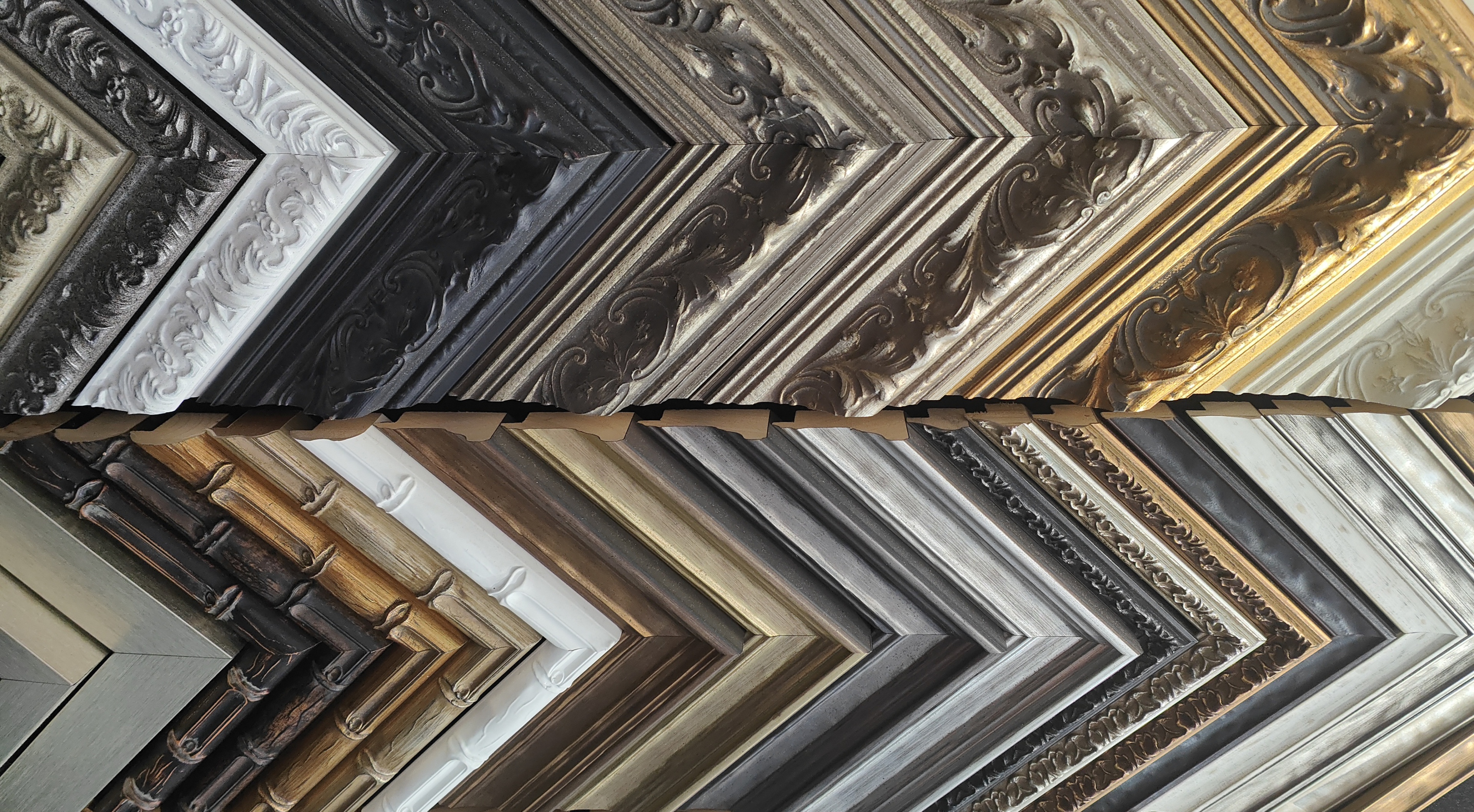
Frame material plays a big role in how your piece looks, feels, and lasts. Some materials offer a clean, modern style, while others bring warmth or a traditional finish. The right choice depends on what you’re framing, where it will hang, and the style you want to achieve.
Here are some common options:
If you’re after a sleek, modern look, frameless display options like metal prints are also worth considering. These involve printing directly onto aluminium panels, creating a high-gloss, fade-resistant finish that’s ready to hang without a traditional frame. They work especially well for vibrant photos or commercial use, and they suit clean, contemporary spaces.
Each material has its strengths. Your choice should depend on what you’re framing, how much attention you want the frame to draw, and how the final piece will sit within your space.
Frame colour has a big impact on how your photo or artwork is perceived. The right colour will draw attention to the piece without overpowering it. The wrong one can clash with both the image and the room.
There’s no single rule, but these guidelines have helped our clients over the years:
A mat (the white or coloured border between the artwork and the frame) can help separate the image from the frame and give it more breathing room. This is especially useful when the artwork has strong colours or detailed edges.
When in doubt, choose simplicity. A clean black, white, or natural timber frame will suit almost anything and won’t date over time.
Different pieces call for different framing approaches. What works for a family photo won’t always suit a canvas, print, or jersey. Use this quick reference to help guide your decision:
| Item Type | Framing Tips |
| Family Photos | Stick with clean black, white, or timber frames. Add matting for a classic, timeless look. |
| Art Prints | Consider a wider frame or subtle contrast in colour. Use a neutral tone to support bold designs. |
| Canvas Artwork | Float frames give a polished gallery finish. If the edges are painted, you may not need a frame at all. |
| Jerseys or Keepsakes | Use a deep shadow box frame to preserve and protect the item. Ensure there’s space between the item and the glazing. |
| Certificates or Documents | Simple, slimline frames work well. Choose a neutral colour and consider matting to create structure. |
If your item doesn’t fit neatly into one of these categories, don’t worry, the most important thing is that the frame protects and enhances the piece, and suits your space. If you’re in doubt, you can always contact your nearest framing consultant for some advice.
Feeling unsure about your frame choice? Our expert checklist will help you make clearer, more confident decisions and avoid the common mistakes that can leave a piece looking mismatched or unfinished.
Use it as a final gut check before you buy:
☐ Have you thought about what the frame needs to do? Protect, highlight, or simply finish the piece?
☐ Does the style of the frame suit the subject and the story it tells?
☐ Have you picked a material that feels right for the room and will last over time?
☐ Does the colour of the frame work with both the piece and the space it’s going into?
☐ Would adding a mat help give the image breathing room or make it feel more complete?
☐ Is the size and scale of the frame right for the wall or layout you’re planning?
These are the same questions professional framers ask every day. Going through them now can save time, avoid regrets, and make sure your finished piece looks exactly how you imagined (or better).
If you’re still unsure about frame styles, colours or materials, that’s completely normal. Sometimes seeing the options in person, or talking it through with someone who does this every day, makes all the difference.
At GC Printing and Framing, we help people choose frames that work for their piece, their space, and their budget. Whether you have a clear idea or no idea at all, we’ll guide you through the options and help you land on something that feels right.
Visit our showroom today for a free consultation or give us a call on 0450 557 825 to get started. Our friendly team are always happy to put their design hats on!

Framing artwork or photographs in small spaces requires a thoughtful approach to avoid overwhelming the room. By combining functionality and creativity, you can enhance the charm of a small area while showcasing your favourite pieces. In this blog post, we’ll delve into five practical tips for using frames effectively in small spaces.
The placement of framed artwork can make or break the design in a small room. Thoughtful positioning ensures that the space feels curated, not cluttered.
Strategic placement elevates the aesthetic and helps preserve the functionality of compact areas.
The frame style plays a significant role in small spaces. Opting for minimalist wooden frames can lend a natural, timeless quality without adding visual bulk.
Minimalist frames provide the perfect balance of style and functionality in small rooms.
When wall space is limited, vertical galleries can be a game-changer. By stacking frames vertically, you can add personality to the room without compromising space.
Vertical arrangements draw the eye upward, giving the illusion of higher ceilings and a more expansive room.
Small rooms often benefit from thoughtful contrasts, and frames are a great way to add depth and interest. Contrasting frame colours can make the artwork stand out while adding a touch of drama to the space.
The right colour contrasts can make small spaces feel dynamic and well-designed.

Frames can be more than decorative—they can also serve a practical purpose in small spaces. Functional frames, such as those combined with mirrors or hidden storage, can maximise utility.
Functional frames make small spaces stylish and efficient by blending aesthetics with practicality.
At Gold Coast Printing & Framing, we understand the unique challenges of decorating small spaces. Our custom wooden frames are designed to enhance your artwork without overwhelming your room. Whether you want to create a vertical gallery, incorporate minimalist designs, or add functional elements like mirrors, our team is here to help. Contact us today to explore how we can transform your small space with our Gold Coast framing services.

Decorating your home is an opportunity to showcase your personal style and create a warm, inviting atmosphere. Among the many options available, canvas printing has emerged as a preferred choice for homeowners looking for a versatile and timeless way to enhance their living spaces. Additionally, canvas framing on the Gold Coast provides a stylish and sturdy way to display artwork, enhancing both its visual appeal and longevity.
Canvas prints offer a sophisticated yet artistic finish that blends seamlessly with various interior styles. Unlike glossy photo prints, canvas provides a textured, museum-quality appearance that enhances the depth and richness of images, making them stand out as statement pieces in any room.
Canvas prints are also highly customisable, allowing you to personalise your space with family portraits, travel memories, or artistic prints. By choosing the right image and size, you can create a visually stunning focal point that adds personality and character to your home.
One of the key benefits of canvas printing is its impressive durability. Printed on high-quality materials and stretched over a wooden frame, canvas prints are designed to withstand the test of time. Unlike paper prints that may wrinkle or fade over the years, canvas prints are resistant to moisture and general wear, making them an excellent investment for long-term décor.
Moreover, canvas stretching on the Gold Coast ensures that prints remain securely framed without sagging or losing their shape. This technique enhances the lifespan of the artwork and maintains its pristine condition, preserving your cherished memories for years to come.
Another reason why canvas printing is a top choice for home décor is its versatility. Canvas prints are suitable for various spaces, including:
Unlike traditional framed prints, canvas artwork does not require glass, which reduces glare and reflections. This feature makes them ideal for rooms with natural light, ensuring that your chosen images are displayed clearly from every angle.
For a polished and professional look, canvas framing on the Gold Coast provides an elegant way to showcase your prints. Wooden framing enhances the natural beauty of canvas prints while offering sturdy support. With a variety of wooden frame options available, you can customise your print to match your existing décor seamlessly.
Maintaining canvas prints is simple, making them a hassle-free addition to your home décor. Unlike traditional prints that require delicate handling, canvas prints can be easily dusted with a dry, soft cloth to keep them looking fresh. Additionally, because they are less prone to glare and fingerprints, they remain visually appealing with minimal upkeep.
Whether you want a single large statement piece or a curated gallery wall, canvas prints provide a budget-friendly way to refresh your home décor without compromising on style. Additionally, investing in professional canvas stretching on the Gold Coast ensures that your artwork maintains its structure and appearance for years, making it a worthwhile purchase.
For homeowners seeking a timeless and versatile way to enhance their interiors, canvas printing is an ideal choice. If you’re looking for expert canvas framing on the Gold Coast and high-quality canvas stretching, turn to Gold Coast Printing & Framing. We offer options like canvas float frame and box frame to add a wow factor to your canvas print. Get in touch with us today to explore our premium canvas printing services tailored to your needs.

Travelling introduces us to new cultures, breathtaking landscapes, and unforgettable experiences. The souvenirs we collect along the way—whether tickets, postcards, maps, or small trinkets—carry sentimental value and tell the story of our adventures. Instead of letting these keepsakes gather dust in drawers, why not transform them into stunning home decor?
You can beautifully preserve and showcase your travel mementos with high-quality wooden framing, creating a personalised display that adds character to your space. Here are five creative ways to frame and exhibit your travel memories.
A shadow box frame offers a unique way to display multiple keepsakes in a three-dimensional format. These deep-set frames allow you to arrange various items together, giving your display depth and texture.
Ideas for Your Shadow Box:
If you’ve taken multiple trips or visited a series of similar destinations, a collage frame allows you to display everything in a cohesive, eye-catching way. Instead of framing individual photos or tickets separately, you can combine them into a larger framed collection.
Creative Collage Ideas:
Maps are more than just guides—they are representations of your journey and the places that hold special meaning for you. A framed map adds a unique and interactive touch to your home while marking your travel history.
Ways to Personalise Your Map Frame:
For a sleek and modern aesthetic, floating frames create the illusion that your memorabilia is suspended between two layers of glass or acrylic. This method is perfect for simple yet striking travel displays.
Best Items for Floating Frames:
Some travel mementos deserve a dedicated, high-quality frame to ensure longevity and presentation. Whether it’s a signed sports jersey from a game abroad, a festival poster, or a beautiful textile from a distant market, memorabilia framing provides both protection and visual impact.
Perfect Items for Memorabilia Framing:
At Gold Coast Printing & Framing, we provide high-quality wooden framing to help you creatively display your travel keepsakes. Whether you prefer shadow boxes, floating frames, or custom collage displays, our expert craftsmanship ensures your mementos remain beautifully preserved. Ready to frame your adventures? Contact us today to bring your travel stories to life.

Choosing the right fine art printing service is important for anyone who values quality and attention to detail. Whether you’re an artist, photographer, or art collector, the ability to transform your work into a beautiful, durable print depends on the expertise of the service you choose. With various options available, deciding which provider will best meet your needs can be overwhelming. This blog will help you navigate the key factors to consider when selecting a fine art printing service, ensuring your artwork is showcased at its absolute best.
High-quality printing transforms your artwork into a masterpiece that retains its original essence. The best fine art printing services utilise cutting-edge technology, such as giclée printing, to produce rich, vivid prints that stand the test of time.
What to look for:
The choice of materials and inks can dramatically impact the visual appeal and longevity of your prints. Premium materials, such as acid-free paper and museum-quality canvas, enhance the richness of the artwork, while high-grade inks ensure they withstand time and environmental factors.
Factors to consider:
Collaborating with a service provider offering various materials ensures you can choose the best combination for your artwork.
Customisation is key in fine art printing. A tailored approach ensures your artwork receives the right treatment, from size adjustments to framing options that complement its aesthetic. Framing, particularly with wood, can elevate the overall presentation and make your art ready for display or sale.
Customisation benefits:
Choosing a service that integrates wooden framing ensures a seamless and professional finish, eliminating the need for additional services elsewhere.
Time can often be a deciding factor when selecting a printing service. Whether preparing for an exhibition or fulfilling client orders, working with a provider that can deliver on time without compromising quality is essential.
Ask these questions:
The reputation of a printing service often reflects its reliability and quality. Taking the time to explore feedback from other artists, photographers, or collectors can provide valuable insights into their level of service.
How to assess reputation:
At Gold Coast Printing & Framing, we pride ourselves on providing premium fine art printing services on the Gold Coast that bring your creative vision to life. Ready to bring your digital memories to life? Contact us today or visit our print shop on the Gold Coast to explore our services and start your journey towards exceptional fine art prints.
Ever wonder why some prints stand out more than others? The secret often lies in the difference between fine art printing and standard printing. While both methods reproduce images, fine art printing offers quality and craftsmanship that standard printing simply can’t match. Let’s explore the unique features that make fine art printing a superior choice for artists, photographers and collectors.
The materials used in fine art printing significantly upgrade from those used in standard printing. Fine art prints typically employ premium papers like 100% cotton rag, known for their archival qualities. This ensures that your artwork or photograph retains its vibrancy and fine detail for many years. Unlike standard printing, which often uses lower-quality paper, fine art printing offers long-lasting results with premium materials. The rich texture of the paper enhances the visual appeal and quality of the print.
Colour accuracy is crucial when it comes to fine art prints. Fine art printing uses advanced inkjet technology and custom profiling to reproduce colours with stunning precision. This method ensures that even the smallest details are rendered faithfully, capturing the full tonal range of the original image. In contrast, standard printing often struggles to achieve the same depth of colour, leading to prints that look flat or washed out.
When opting for fine art printing, you’re given greater control over the final outcome. From choosing the paper texture to adjusting the colour profile, every step is customisable to suit your artistic vision. Standard printing tends to be more restrictive, often limiting the choice of paper or finishes. This customisation is especially important for artists and photographers who want to maintain the integrity of their work in print form.
One of the key advantages of fine art printing is its focus on longevity. The combination of archival-quality paper and fade-resistant inks ensures that fine art prints can last for generations without noticeable degradation. On the other hand, standard prints may fade or yellow over time due to the lower quality of materials. If you’re looking to preserve memories or artwork, fine art printing is the obvious choice for durability.
Fine art printing isn’t just about machines—it’s about expertise. Each print is handled with care, often requiring a detailed review to ensure that the final product meets high standards of excellence. This craftsmanship is a hallmark of fine art printing, setting it apart from mass-produced standard prints, where speed often takes precedence over quality.
Another major differentiator is the textures and finishes available with fine art printing. For instance, the smooth, matte texture of cotton rag paper or the reflective quality of metallic pearl paper adds a new dimension to your artwork. Standard printing, which commonly uses glossy or semi-gloss paper, simply can’t replicate these unique finishes. The right texture can dramatically enhance the visual impact of a piece, making it feel more tactile and professional.
Fine art printing allows you to match the paper and finish to your artwork, which is a luxury standard printing that isn’t often afforded. Whether you’re looking for a matte look for a minimalistic photograph or a glossy finish for a high-contrast piece, fine art printing gives you the flexibility to tailor the medium to your vision. This level of personalisation is especially valuable for artists and collectors who want their prints to stand out.
At Gold Coast Printing & Framing, we provide fine art printing on the Gold Coast. We offer a wide range of premium paper options, custom sizes and wooden framing to bring your artwork to life. Our expert team is dedicated to delivering high-quality prints that showcase the beauty of your work. Visit our print shop on the Gold Coast to explore how we can help you create stunning fine art prints that last for years to come.

Have you ever looked at a cherished piece of art and wondered how to preserve it for years to come? Whether it’s a family heirloom, a prized painting or a limited-edition print, preserving your artwork should be a priority. The right frame doesn’t just complement the piece—it also plays a vital role in protecting it from the elements. When it comes to valuable or sentimental art, custom framing is key to ensuring it lasts a lifetime. Here are some essential tips to help protect your artwork through expert framing for long-term preservation:
When selecting a frame, the material makes a huge difference. Opting for a high-quality wooden frame provides a timeless aesthetic and durability that lasts. Wood is an excellent choice for art preservation because it is strong, less prone to bending or warping and can handle the weight of larger pieces. Plus, wooden frames can be customised to suit any style, offering both protection and visual appeal.
Unlike metal, which can corrode over time, wood remains stable and reliable—making it the preferred choice for valuable artworks.
The materials surrounding your artwork are just as important as the frame itself. Acid-free matting is non-negotiable when it comes to preventing long-term damage. Regular matting can contain chemicals that break down over time, which may cause discolouration, fading or even deterioration of your artwork.
Acid-free mats, on the other hand, act as a barrier between the artwork and the glass, protecting it from moisture and harmful chemicals. They help preserve the piece’s original condition, ensuring it remains as vibrant and beautiful as the day you first saw it.
Artworks, especially those exposed to natural or artificial light, are vulnerable to fading. This is where UV-resistant glass comes into play. By blocking harmful ultraviolet rays, this special glass helps prevent the gradual fading and discolouration caused by light exposure.
Whether you’re framing a watercolour painting, a limited-edition print or a photograph, UV-resistant glass acts as an essential protective layer. It’s particularly important for artworks displayed in areas with lots of sunlight or homes where lighting can’t always be controlled.
One size does not fit all when it comes to framing valuable artworks. Custom picture framing ensures your piece fits perfectly within the frame, preventing unnecessary movement or stress on the artwork. A proper fit minimises the risk of damage over time, especially for delicate pieces such as paper-based artworks or fabric.
Additionally, custom framing allows for the choice of styles, finishes and colours that enhance the artwork’s visual appeal while maintaining its safety. A professional picture framer can tailor a frame to suit the artwork and its surroundings, ensuring a seamless blend of form and function.
Moisture is a silent threat to any artwork. Whether it’s from humidity in the air or accidental spills, exposure to moisture can cause mould, warping and irreversible damage. A professional framing service will use proper sealing techniques, such as adding a dust cover or sealing the frame’s back, to protect the artwork from external factors like humidity and dust.
It’s important to select a picture framer who understands the Gold Coast’s specific climate conditions, ensuring your artwork remains protected in both humid summers and cooler, drier months.
At Gold Coast Printing & Framing, we provide custom picture framing on the Gold Coast. We offer high-quality wooden frames, acid-free matting and UV-resistant glass to preserve your treasured pieces. Our picture framers on the Gold Coast understand the importance of using the right materials to ensure long-term preservation. Contact us today to discuss your framing needs and discover how we can help protect your valuable artwork for years to come.
Speak with our expert team to explore your custom printing and framing options—no obligation, just honest advice.